
Optimizing your landing pages for lead generation is just as important a part of your online marketing campaign as advertising on social media or setting up your email marketing campaign. Too often the landing page becomes more of an afterthought, with campaigns left to land hard-earned traffic on a regular web page with no proper structure. So let’s change this phenomenon of throwing away clicks on pages that won’t convert and let’s build a killer page with these 5 tips that will make your landing page stand out!
Overall, think about your landing page as if you were to tell a story and you only had 10 seconds to do so… Ready? Let’s dive in.
1. Headline / Sub-heading
Remember the last time you clicked on a link that took you to a website say, with an offer? How long did you spend on that landing page trying to scan through it? Time has become our most valuable asset, and as marketers we complete for extremely thin slices of it. You must have an incredibly enticing headline to invoke curiosity and then drive your point further in the sub-heading. Here are some great techniques to improve these parts of your page:
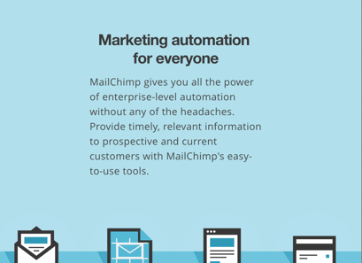
Provoke, ask questions, invoke curiosity – touch upon a pain point your persona is experiencing. Keep it really simple. Your sub-heading is there to explain what the real deal is, your headline is there to make sure your users actually get to the sub-heading. Mailchimp used this headline to keep it short and sweet and drive their message home. We recommend keeping your headlines less than 10 words, potentially less than 5.
2. Call-To-Actions
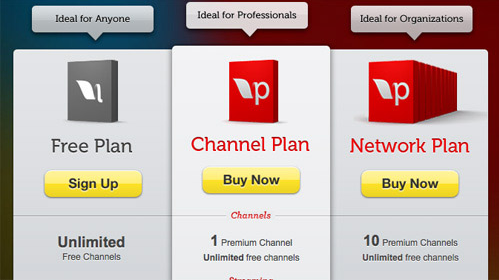
Users don’t want to think when browsing your landing page, they are looking for visual, logical and emotional cues to lead them through your explanation and find the solution they came to you for. Help them by breaking your landing page up into segments by using dividers, colours or paragraphs and keep in mind that each segment has a goal. This goal is either leading the prospect to another section of the landing page or to convert them into leads, make them download an ebook etc. Clear, well-designed Call-To-Actions are the bread-and-butter of every landing page and should also be subject to continuous testing. Don’t be afraid to implement CTAs in the middle of your landing page – some of your users have already educated themselves before coming here so they might be ready to contact you.
The Sign Up / Buy Now buttons in the example below are nicely complemented by the segmented plans for different personas.
3. Testimonials / Social Proof / Trust Symbols
Since almost 9/10 users will consider other user reviews before engaging with a product or service online it is essential to understand this form of human behaviour and profit from it. Since the dawn of time we have relied on the evaluation or approval of our peers when considering a particular item or situation. By applying testimonials, social proof, trust symbols on your landing page you can create a trustworthy image without ever having met the user whose attention you own for those golden 10 seconds.
Examples:
- Trust symbols: BBB membership, any industry associations you’re affiliated with or chamber of commerce membership
- Social Proof: reviews from users on Google+ or Facebook, a tweet from a fan of your service/product, a quote from a thought-leader in your industry
- Testimonials: good old fashioned customer testimonials optimally seasoned with the actual photo of the person, their name (even if it’s just their first name), and a timestamp on the testimonial, as users prefer fresh reviews and a star rating for easy scannability.
4. Pain and Pleasure
We all love a bit of drama. If you can create a super-fast emotional rollercoaster on that page you are more than likely to reap the rewards by getting that form filled out. Listen to what your customers or patients ask most often, what they complain about, what their symptoms or issues are and include it in your landing page in order to offer the solution to them right away. And check it out, the solution comes in a monthly subscription format so you don’t have to invest large amounts of money upfront. Or, it comes in different colours, and oh by the way, now it’s 10% off. First create drama, then offer a solution and incentivize buying NOW.
5. Contact Methods
Sounds obvious, but we have seen many landing pages without proper methods of contact information offered. It is essential that you include contact information, such as a large, easy to find phone number, email address, fillable form, online chat or Twitter account to name a few, but feel free to use pigeon mail if that’s what your users prefer.
This well-designed landing page clearly indicates that your method of contact is the form.
+1: Mobile-friendly
Here’s a bonus one for you! If at least 10% of your users arrive to your landing page from mobile devices you should definitely direct them to a page optimized for that. If you are a savvy online marketer (and of course you are), your email marketing campaigns will be a major driving force for these visits. Did you know that 66 percent of emails are opened on either a smartphone (47.2 percent) or tablet (18.5 percent)? Time to get out there and impress those users!
Questions about landing pages, conversion optimization or why the answer to the meaning of life is 42? Contact us. And remember: “It’s much easier to double your business by doubling your conversion rate than by doubling your traffic.”
