
As we head into 2015, it’s a little scary to think that there are still websites online like this. When you are designing a website, whether it’s for yourself or for someone else, keep in mind the following 10 web design mistakes you should avoid:
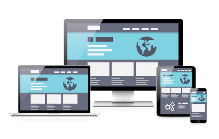
Non-Responsive Design
More and more people are switching to browsing the world wide web on their mobile devices. If your website doesn’t adjust to the screen resolution of the device it’s viewed on, people will more than likely run away. Ain’t nobody got time fo dat! If someone is required to pinch their screen to zoom in to view the information they are looking for, let’s be honest, no one will do that anymore.
Building a Website In a Table
This is not the 1990s anymore. Tables have very limited customization capabilities in terms of how you want to lay out your content. If you’re not capable of customizing your CSS, Bootstrap is strapped (get it?) with a lot of CSS and JavaScript for you right out of the box. It breaks up a browser window into a grid that’s very easy to manipulate and customize. WordPress and other content management systems have tons of themes that will make your website look clean and modern.
Using Flash
Do you want to cut out your Apple-device-using audience completely? If you answered “No” to that rhetorical question, put your flashy thoughts away. The question isn’t whether or not Flash can help you make stunning websites or not. The reason you should avoid using Flash is because it’s outdated, it uses a lot of resources to load up (it would have drained your battery by the time you read this if there was Flash here), it’s unreliable, and it’s insecure. Apart from it being an outdated practice, there is so much cool stuff you can do with HTML5 and CSS3 that you shouldn’t even think about resorting to Flash.
Gifs and Other Funky Stuff
Unless you’re Reddit, 9Gag, or Funny or Die, stay away from GIFs. They will drastically decrease your page load time and people will turn away from your website. However, GIFs here and there could be funny. So if you haven’t run away yet, here’s a dalmatian trying to sit on a baby.

Courtesy of Funny or Die
Bad Navigation
Navigation is one of the most important components of your website. That is your user’s map around the website. What people might forget, is it’s also Google’s map around it as well. Apart from your sitemap.xml, Google crawls your website’s links in the way they are presented. If you’re using JavaScript to show inner pages of the navigation bar, Google won’t notice them, hence it won’t crawl your inner pages. Good luck trying to rank those then 😉
Using Dark Backgrounds
Have you ever picked up a book that had black pages and white font? Me neither (maybe cause I don’t read a lot of books). That is strictly because a human eye would get tired of focusing light things on a dark background. We are so used to being presented with light coloured things, so if you don’t want people squinting as they are trying to read content on your site, make the background a light colour, pleasing to your own eye.
Having Little Content
Not good.
Having Too Much Content On a Single Page
Just like above, where you don’t provide a user with the right amount of useful information, which annoys the user, it’s also bad to have too much content. How much is too much? A safe point is having between 700 and 1000 words per page. Unless you know your content will engage the user to read a lot, don’t write it. People in this day and age are lazy and expect the information they are looking for to be at their reach as quickly and as easily as possible. If you’re going to write something long, make sure you break up your content with the right header structure.
Background Music
Background music on a website is almost as annoying as people chewing in your ear. I want to be able to pick my own music that I want to listen to. Even if you think you know your audience inside and out, chances are they will click away from your website as soon as they hear unplanned music.
Stuffing of Ads
We all want to make as much money as we can from our websites, but having too many ads will guarantee you losing money as opposed to making it. Have ads that are relevant to your services/whatever you’re talking about to help users get what they need instead of stuffing them with dating site ads on your eye exam service page. It’s not that better vision won’t help you pick out a hot date, it’s just completely irrelevant to what you’re getting your audience to do.
Avoiding the common mistakes above will help you achieve better results online. Don’t forget that the way your website looks and feels directly correlates with your user’s engagement on it. So if you’re looking for more conversions, let your website help you obtain those! If you have any questions about your website or how to make it more appealing, don’t hesitate to contact us or leave a comment below.
