
Landing pages are a great tool for turning your visitors into prospects, but they can easily turn users away if they aren’t done correctly. Your landing pages should always be designed with a specific goal in mind and the more cluttered or confusing they seem, the tougher it will be to get the conversions that you want.
Are you worried about the performance of your landing pages? Thankfully, there’s always time to improve and get better. Let’s take a quick look at the biggest and most common landing page mistakes out there.
Not Defining The Audience And The Goal
Before you start building anything, you need to figure out what your audience looks like. Define your target audience and then the purpose of your landing page (this is your campaign goal).
Always keep in mind that you should be building your landing page around your goal/objective. Thinking like this will allow you to focus more on what you want done on your page instead of creating elements that can cause friction.
No Offer!

Once you’ve established your audience, you need to offer your visitors something in exchange for the personal data that you’re seeking.
There are a lot of pages out there that ask people for personal information, but lack any value offers to properly entice them. Everyone likes getting rewards and I think we can all agree that getting free stuff is pretty awesome!
What kind of things should you be offering your audience? Here are some quick examples of digital content giveaways that people consider fair trades for their personal info: free online courses, whitepapers, eBooks, podcasts, webinars, consultations, and more! Put yourself in your audience’s shoes and ask yourself: would I hand over my email for this?
Too Many Form Fields
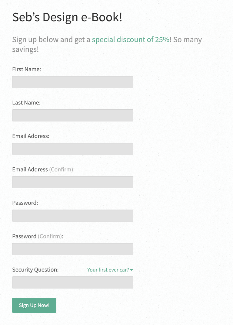
Your visitors don’t want to have to fill out 10 form fields just to get an eBook or whitepaper. Unless you’re a very famous writer or brand, the chances of people converting are very low.
Only use the minimum amount of form fields required for what you are offering. Ideally, you can test this to find out what converts best, but you should try to focus on taking only what you need to meet your goals. An email should normally be enough for most offers.
Ads Don’t Match Landing Page
This is something that always shocks me – message matching is one of the key ingredients to a successful landing page. If you’re confusing people before they even arrive, then you can’t expect them to stick around.
This is an example of an ad that appeared in the search results when I was looking for “Rob Ford T Shirts” (don’t ask me why).
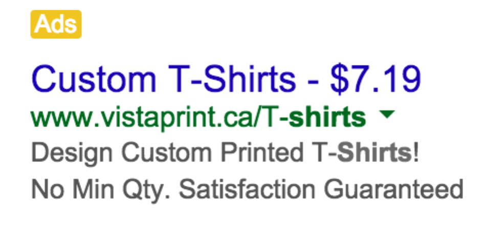
I clicked on this ad and ended up landing on this page.
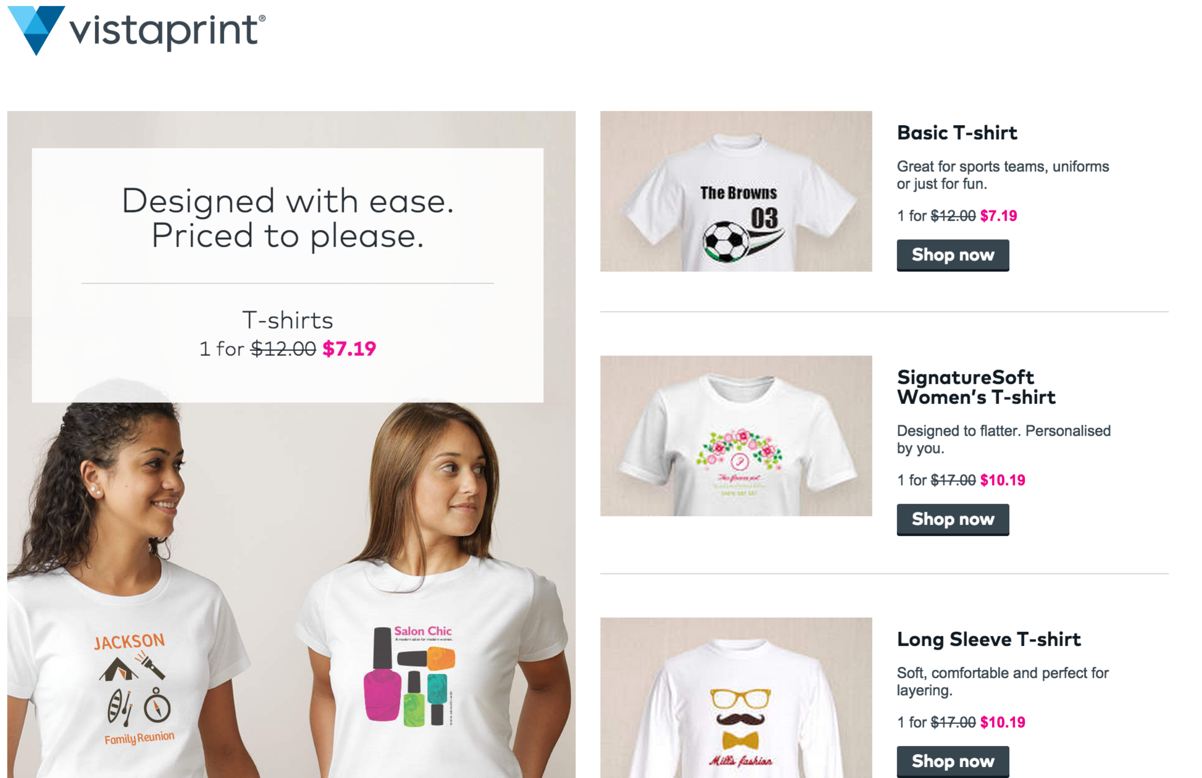
Not only does this ad not match my original query, but it also takes me to an unrelated page that has nothing to do with “Rob Ford T Shirts.” This is a colossal waste of both money and time.
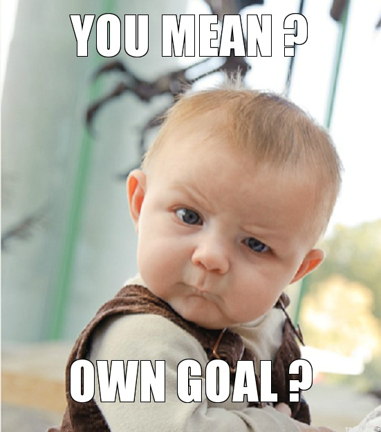
Poor Imagery
High quality imagery can make all the difference for your landing pages by generating interest in your content and guiding the emotional reactions of your audience. Think about it: when you land on a page and see people smiling, you’ll usually start to feel that the page is trustworthy.
Here’s an example of a landing page that uses an image of a cute baby. People instantly feel connected to the baby on this particular landing page as it adds a human element.
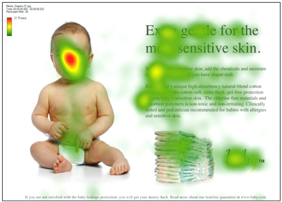
The heat map on this page shows the areas where people are looking the most, but notice that when the baby is looking at the content and CTA, viewers will tend to look there too.
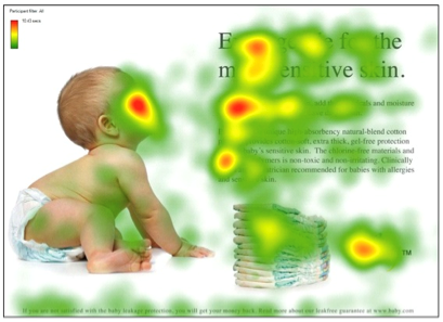
We are hard wired to look where other people are looking.
CTA In The Wrong Place
Most people will skim through your website, so it’s crucial that you have your CTA in the right place. After all, 80% of their time is spent looking at information above the fold, so you need to make sure the layout of your landing page reflects that.
People don’t read landing pages. Period. So keep your copy short and sweet and place your CTA accordingly. Dropping it at the end of a long block of text and hoping that people take in your every word is madness.
Don’t Ramble On In Long Paragraphs
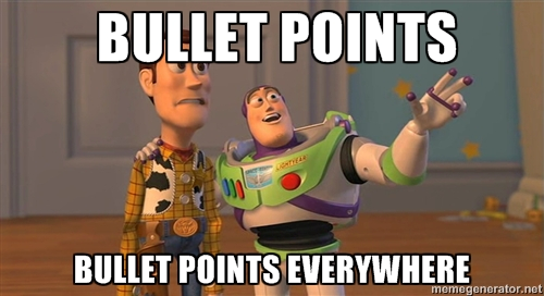
Continuing on from my last point, you have about 5 seconds to grab a visitor’s interest. A strong headline is your first chance to grab their attention, but once this has happened, you need to then list out some simple benefits in bullet points rather than long paragraphs.
Try to turn the text you wrote into about 3-5 bullet points explaining exactly why a user should fill out your form. Speak to their pain points and answer their questions through your benefit statements.
- You have 5 seconds to get people’s interest.
- Don’t ramble on using paragraphs.
- Use 3-5 bullet points.
- Explain why they should complete your form.
- Speak to their pain points.
This is a lot easier to read, right?
Point made. Pun intended.
Want to make your landing pages pop? Let’s talk!
